Taking Good Pictures
Do you know how to take good pictures of your facility? With around 600 communities and board and care facilities in the county, a good set of pictures on your website or brochure will help your RCFE get noticed. You don’t need a fancy camera or equipment to take good pictures because the most important element is already there in abundance- good natural lighting.
Getting Good Lighting:
Let’s start with the exterior front photo of your home or community. If you pick the right time of day to take this photo depending on the direction your property faces, it will make your photo evenly exposed, and you won’t have to fight issues like dark shadows and harsh lighting that will wreak havoc on your camera’s metering system. You want the sun to be directly IN FRONT of your property when you take the picture. This makes your property look nice and bright, minimizes harsh, distracting shadows, and helps light up dark, recessed entryways common in San Diego County homes.
Here’s a quick guide for the best time of day to take pictures depending on the direction your property faces:
East-facing: Morning, before 10am.
North-facing: Between 10am and 2pm.
West-facing: In the afternoon.
South-facing: Early morning after sunrise, or late afternoon before sunset.
Avoid cloudy days, as it makes the scene look gloomy. You want bright blue skies in the background.
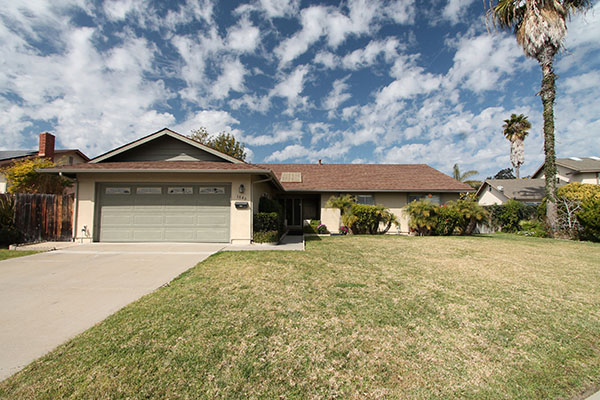 Bad: The recessed entry is dark.
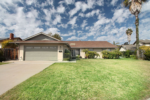 Better: A well lit entryway is inviting for residents.
Leveling your Shots
Make sure the photo is level, and primary architecture lines are straight. Pick the most prominent vertical line in your building and align it to be as straight as possible top to bottom. In the photo of the facility below, the turret with the two tall cypress trees are clearly the most prominent vertical line, so we aligned that to be vertical. Straight lines in photographs accurately capture the architecture of the building and make the property look appealing. Slanted photos can make the building look cartoonish.
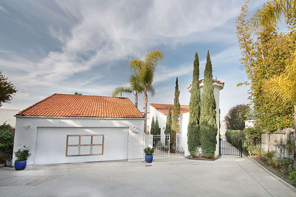
The turret in this facility is vertically aligned. Correct alignment can highlight the architectural beauty of a building.
Interior Shots
Prospective residents like bright, decluttered interiors. Consider having a bedroom staged with pressed sheets on the bed, a nightstand, and a lamp. We often visit facilities with luxurious wood paneled living spaces. To convey the sense of beauty of these rooms, we light them up as much as possible for the photo to illuminate the wood grain detail.
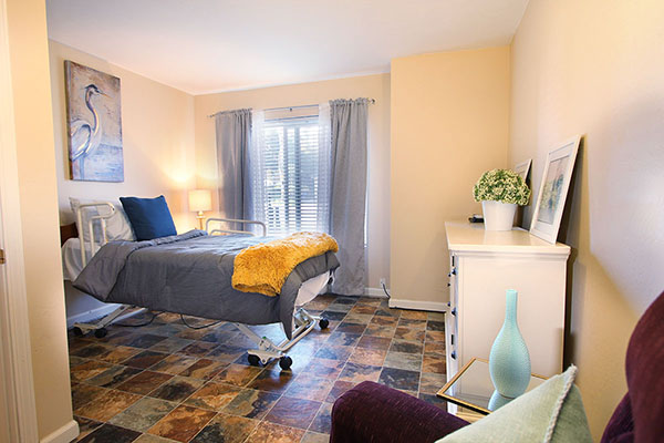 Simple furnishings, and bright lighting makes a small private room feel comfortable.
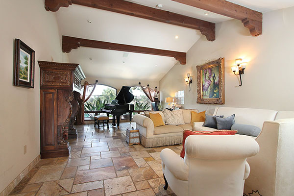 Bright lighting showcases dark, luxurious wood features in a photograph.
If the bedroom has a private bathroom, try to angle the photograph to capture that. For any photo, have a purpose, and capture the highlights of your facility.
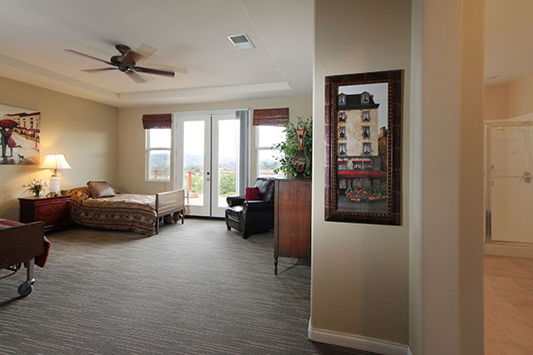 This photo has just a glimpse of the attached bathroom, but it’s enough to let families know this is a master bedroom.
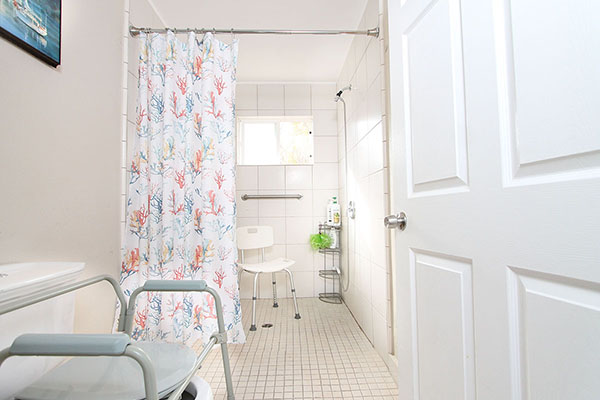 This photo shows the bathroom has a roll in shower, a useful feature for residents.
Good luck, and let us know if you have any questions!
Quan Nguyen
Choose Well San Diego

